Tuesday, September 21, 2010

Caravan of Slaves

Caravan of Slaves

In our time we may say that slavery is something of the past. We probably thought it would never happen again and everybody is a free man and will always be. But if we stop being ignorant slavery still do exist. There are people who lost their freedom. People who live behind the walls and under the guns of the Zionists. It is the worst kind of slavery though they are not shackled, bought and sold like during the olden days. But human greed will one day brought back that kind of slavery. In 3000 A.D. is probably that time.

Slave Cage Thumbnail

We will see human in chains and cages being sold in the market place. When thinking of such cages I always think about the rounded bird cages. Birds are always a symbol of freedom. There are free to fly where ever their wings may bring. The sky is the limit. For a cage is the worst place to be for any creature who want to be free.

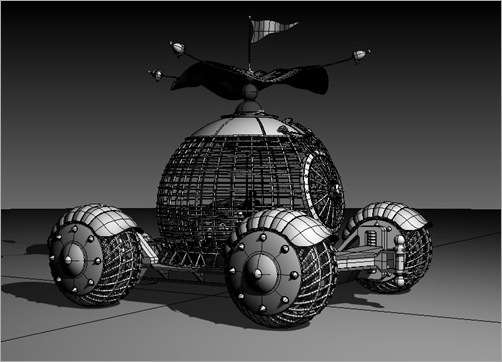
Still inspired by the renaissance period I breathe some splendor to my cage design.  Though it may sound sadistic but it is just a reflection of what the Zionists felt about such inhumane situation just like the Nazis felt towards them. My thumbnail design rode on that feeling. I did the sketch once and my mind never shifted since. I knew that it would look great on the desert travelling in a caravan with its canopy, flags and the roving wheels. So much was the fantasy with pencil and paper. In 3D it was quite a challenge to  make the cage looks robust and secure.

Slave Cage

In the caravan scene the cage is the main focal point compared to the other vehicles. Most of the drama happen here. The cage was easy but the door and its mechanism took a bit longer. It must look secure enough to hold at least ten people inside each cage. The wheel with it skeletal form with added lobster-like guard were also a killer. The cherry on the cake are the canopy and the flag. I could imagine how they bounce and flap in the wind.

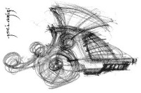
Engine Head Thumbnail

The next design is the Engine Head that drags those cage units. Like the cage design this thumbnail was also done once and without any further changes made. It was not inspired by any other design. It was just a quick sketch from the picture in my mind. The top hood probably has some Roman root. The principal of the design is based on compact and power. Travelling through the arid landscape and extreme weather condition it is equipped with ample protections to shelter the operators.


Engine Head Front

Engine Head Back


Though in the scene the Engine Head mostly remains in the background but I did a lot of changes. Not that it really needs one but the design inspires many new ideas. I redesigned the front screen and added some sensors and lights. At the back I improved the look of the limb to give more 3D depth and engine details. The efforts will not go to waste because for the promos and animation sequences I will have more angles to play with.

Trailer

The last vehicle in the convoy is the Trailer. This one took a number of sketches before I finally settled on one. The main shape is inspired by the old American trailer probably back in the 50s. The rest are totally new from out of nowhere. The Trailer is where the Slave Master and his men travelled in. It has the sense of comfort with all the security and provisions. It do not have an engine of its own but has its own Engine Head to drag it around.


Trailer Front

Trailer Back

Like the Engine Head the Trailer also remains in the background most of the time. Because of its roundness it seems to look more sci-fi but I added a bit of renaissance touch in some places. Since it is the Slave Master’s vehicle it look more luxurious rather than robust like the other two and much simpler to design.

All vehicles are set to go. The caravan will travel across the unforgiving landscape dragging those slaves to an uncertain future. But the sense of darkness is on the horizon. Is this how the future is going to be? Is the future generation responsible for such dark outlook? Or is it the fruit from the poison seed that was sown in the present?


Technorati Tags: ,

Tuesday, September 14, 2010

Palestine 3000 A.D. Official Logo

I was in San Francisco in 1996 with some studio friends taking a break after the conference in L.A. After a whole day touring we ended up at one of the comedy club by the Pier in the evening.  We enjoyed the stand-ups. So was the crowd of multi-nationals. There was a group of girls near our table. One of the stand-up asked them where there are from and what they do for a living? They said they are students from Israel. That sounded fine to everybody. Then they were asked what are they going to do after their studies? They replied proudly that they are going to join the army. The stand-up who incidentally  looked like he was from Hitler’s army responded by asking “Do you want my land?” The crowd burst into laughter. The students presumed that the whole of United States support the Zionists. By now I guess they have realized their killing career.

The Zionists propaganda machine really got into them. They thought they are doing something righteous.  Later when I was a living in Tennessee I found a website that is selling IDF (Israel Defense Force) memorabilia.  The propaganda machine is still hard at work. I have seen people wearing T-Shirts and cars with bumper stickers that support the Zionists. It seems hip to support the robbers and killers. While others who support the Palestinians are frown upon and even tagged as supporting the terrorists. The propaganda machine is hard at work bending the minds of the media and leaders of the so called civilized world.

The main objective of Palestine 3000 A.D. project is to untagged those labels they stamped upon us who support Palestine. We also want to attract others who are still ignorant about the issue. Others who are still in fantasy land who just want to be cool and hip. That is the reason that I place  much emphasis on style in the design. You still can be hip if you associate yourself with Palestine. Now your hipness has substance and not just pure fantasy.

The centre of that style has to be symbol or a logo. When I started designing the poster with the logo type around 3 years ago I was not into blogging or Facebook. I did not really care if the logo type was going to look good if it is reduced to a tiny thumbnail. I was just trying to stir myself up to write the script. Since I have started planning for the promo recently a logo design was high on the agenda. 

Palestine 3000 A.D. Logo Sketch

I did single line strokes based on the Palestinian flag and fit it inside a circle but the design looked weak. It did not have enough grunge in it as I did for the initial logo type. Then I realized that I need to add some body to it and came out with this  new sketch. It seems simple like it was scribbled on a napkin but it took a month to realized it. The design has room to grow because it will be adapted into other promotional medium.

Around 6 month ago I met a manager of an art bookshop for lunch. He briefed me on various ways how books are laid out on the shelves. He said it is Palestine 3000 A.D. Cover Page Layoutimportant to have maximum exposure of the cover design no matter how it is laid out. Sometime the books are laid out with their front covers faced out and overlapped by other books they are promoting. Usually one third of the left hand side of the books are exposed leaving the main title two-third covered. If you do  not have any recognizable image or logo on that exposed one third customers may overlooked your book.

Hence that small logo must be prominent enough to be recognizable even at a glance. That means the colour and form demands a serious consideration. Not only it has to be loud enough but it must have a real meaning. That took me a couple of weeks in Photoshop to get the elements together to form a real balance in design.


The grunge still remains in the design. It is not meant to be glossy and shiny. Palestine is not a Disney story. There is nothing to laugh about when people lost their lives, families and homes. There is no perfect line in the design. The thick  grey brush strokes symbolized walls that divide the people and took their freedom away. But in Palestine 3000 A.D. those divisions are about confinement of a different kind. It also symbolized division among Palestinians. To be strong they need to unite no matter what differences they have among themselves. They should not fall into the trap of the Zionists who divide and conquer. They should not be any Hamas, Fatah or Hizbullah or any other factions. It should be just one Palestine. Raise your heads high and be proud just as the logo facing up no matter how hopeless lives may be. The worst prison is the mind. We have to liberate our minds. So I let those grey strokes  exceed the main circle of restriction and division.

Naturally human like to remain divided. We always like to find a reason to be different rather than common. We came from a single blood. It is too precious to shed even a single drop. But we always think that it is them and not us. In our comfort zones we always think that way. But I hope even for a moment you could touch this pain beyond your TVs, movies, games, and comics. Abandon your fantasies and embrace this reality. Listen to what this image speaks. We can help to make it louder.


Technorati Tags: ,,